A guide to Sentiment Composition & Favorability Score
What is GrowByData tracking?
GrowByData’s Compass platform monitors how AI engines like ChatGPT, Gemini, and others respond when users ask questions about your brand, products, or category. Rather than just telling you whether AI mentions you, Compass measures the tone and quality of those mentions over time.
To do this, Compass uses two distinct metrics. You’ll see both of them in the platform, and it’s important to understand what each one means because they answer different questions.


The Two Metrics at a Glance
Sentiment CompositionThe breakdown Shows how AI responses about you are distributed across positive, neutral, and negative sentiment. It’s a percentage split like a pie chart of AI opinion. “60% positive, 30% neutral, 10% negative” |
Favorability ScoreThe summary score A single weighted number that captures overall sentiment in one figure. Designed so you can track trends at a glance and compare performance over time. “Overall perception score = 65” |
⚠️ Why don’t the two numbers match?
This is expected, not a bug. Because the two metrics measure sentiment in different ways, they will rarely produce the same number. Read on to understand how each is calculated.
AI engines are already influencing buying decisions. Find out how your brand is represented.
Schedule a Straegy Session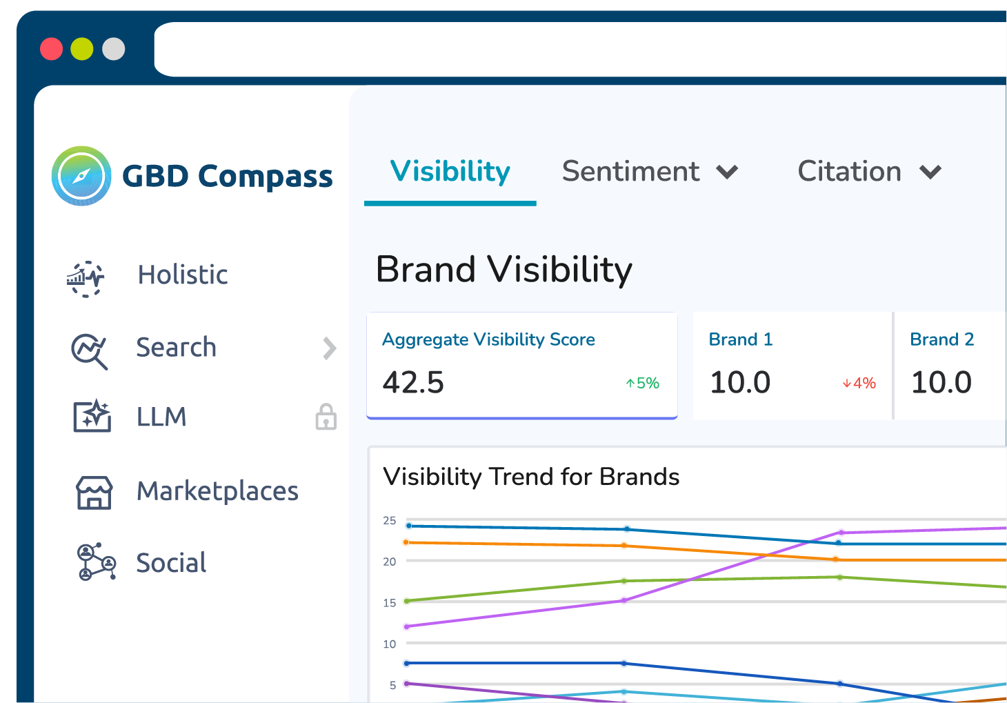
Sentiment Composition
What it shows
Sentiment Composition tells you how AI responses are distributed across three categories: Positive, Neutral, and Negative. Each response analyzed by GBD Compass gets assigned one of these labels, and the metric shows you the percentage that falls into each bucket.
Example
Imagine Compass analyzed 100 AI responses mentioning your brand:
| Sentiment | # of Responses | Percentage |
|---|---|---|
| Positive | 60 | 60% |
| Neutral | 30 | 30% |
| Negative | 10 | 10% |
How to interpret it
Sentiment Composition is your distribution view. Use it to understand:
- How much of the AI conversation about you is positive vs. negative
- Whether neutral responses are dominating (which may indicate AI engines are staying vague or non-committal)
- How the mix shifts over time for example, if negative responses are growing even while the overall volume stays flat
- Important: this metric does not produce a score. It only shows proportions.
Favorability Score
What it shows
The Favorability Score condenses all the sentiment data into a single number so you can quickly gauge overall perception and track changes over time. Rather than treating all sentiments equally, it applies different weights to each because a positive response is more meaningful than a neutral one, and a negative response should pull the score down.
How it’s calculated
Each sentiment category is assigned a weight:
| Sentiment | Weight |
|---|---|
| Positive | +1.0 |
| Neutral | +0.5 |
| Negative | -1.0 |
Using the same 100-response example from above:
| Sentiment | Count | Weight | Result |
|---|---|---|---|
| Positive | 60 | × 1.0 | =60 |
| Neutral | 30 | × 0.5 | =30 |
| Negative | 10 | × -1.0 | =-10 |
Final calculation: 60 + 15 − 10 = 65
The Favorability Score for this example is 65.
How to read the score
| Score Range | What It Means |
|---|---|
| Above 50 | Mostly positive – AI engines are speaking favorably about you |
| Around 50 | Mixed or balanced – positive and negative are roughly offsetting |
| Below 50 | Mostly negative – AI engines are expressing unfavorable sentiment |
Using Both Metrics Together
These two metrics are designed to complement each other. Looking at them side by side gives you a more complete picture than either one alone.
Use Sentiment Composition when you want to…
|
Use Favorability Score when you want to…
|
Finding These Metrics in Compass
Both metrics are available within the LLM Tracking section of the Compass platform. The screenshots below show you exactly where to navigate.
Sentiment Composition – where to find it and how to read the chart
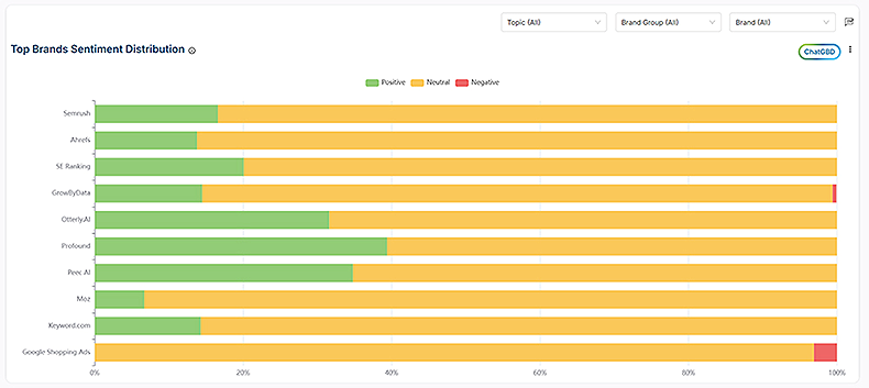
| Bar Chart
Sentiment Composition tells you how AI responses are distributed across three categories:
|
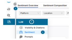
To Navigate report:
|
Favorability Score – where to find it and how to track changes over time
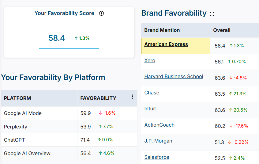
How to Track changes over time:
Note:
|
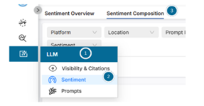
To Navigate report:
-> Sentiment -> Sentiment Composition
|
Need help interpreting your data?
Reach out to your GrowByData account team. We’re happy to walk through your Compass dashboard, explain what your current scores mean, and help you identify opportunities to improve your AI visibility.